
Milk & Bone Reimagined
PrizeOfficial Selection in Illustrate (graphic)
University/SchoolTexas A&m Commerce
ArtistAlexander Manzanares
CategoryNon-Professional
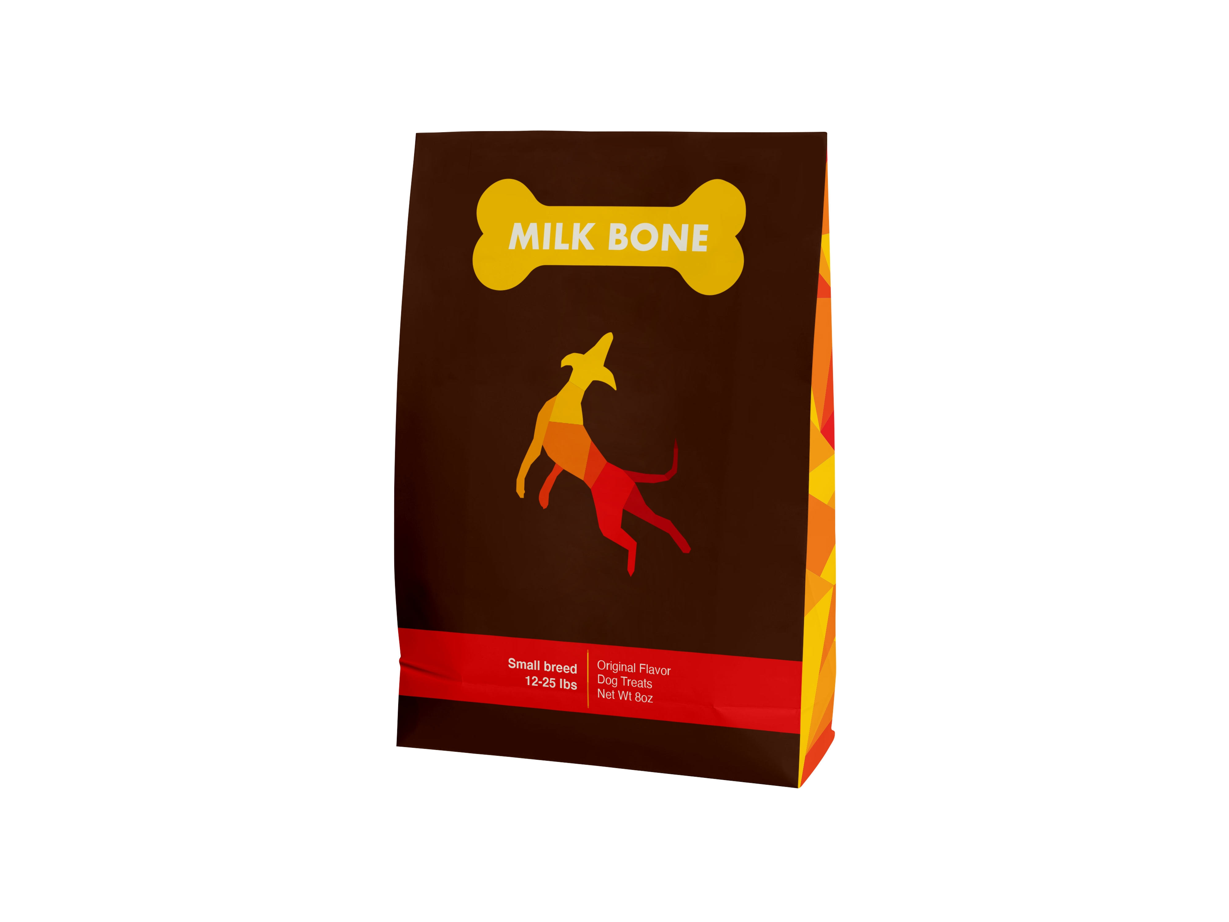
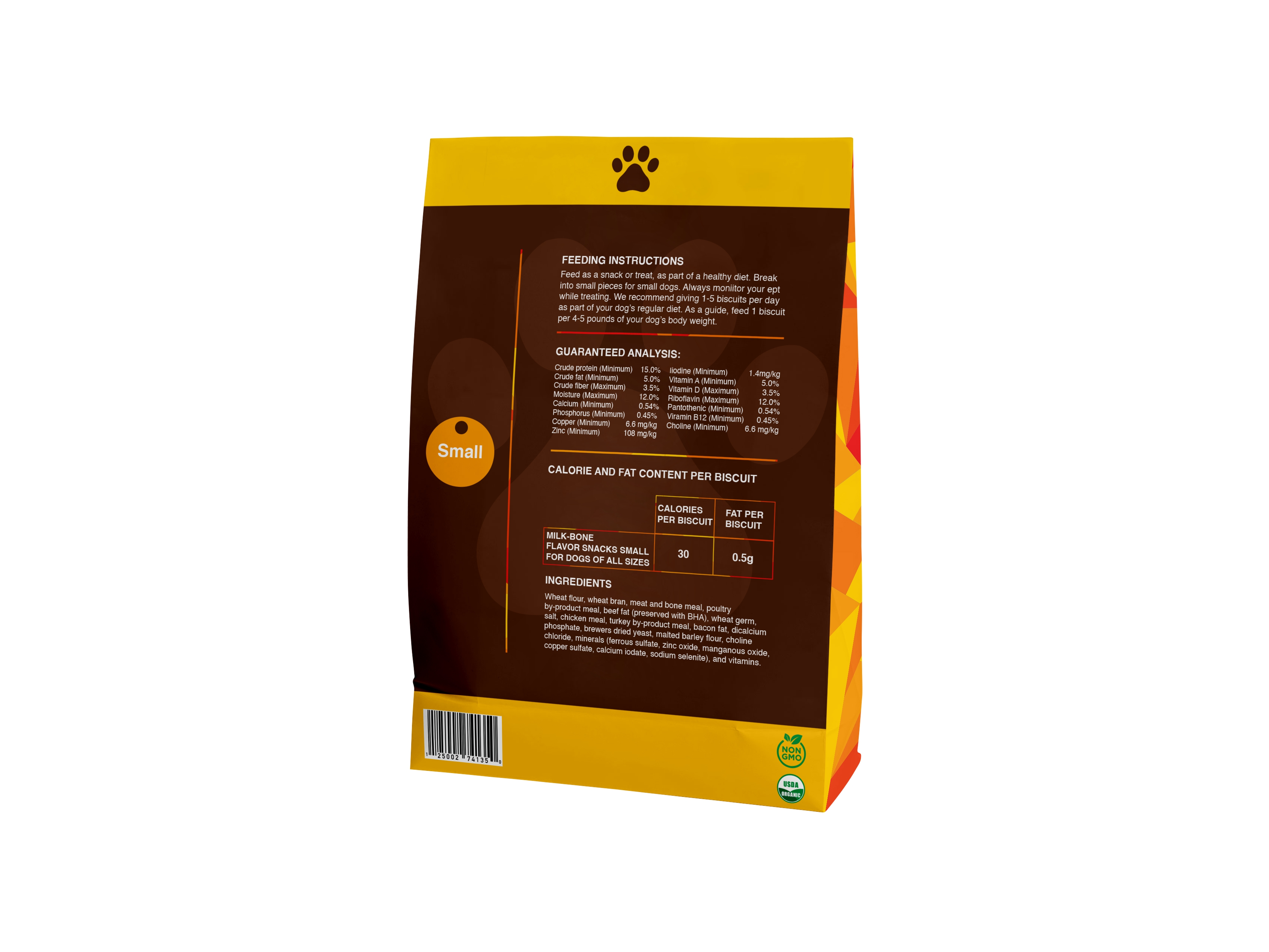
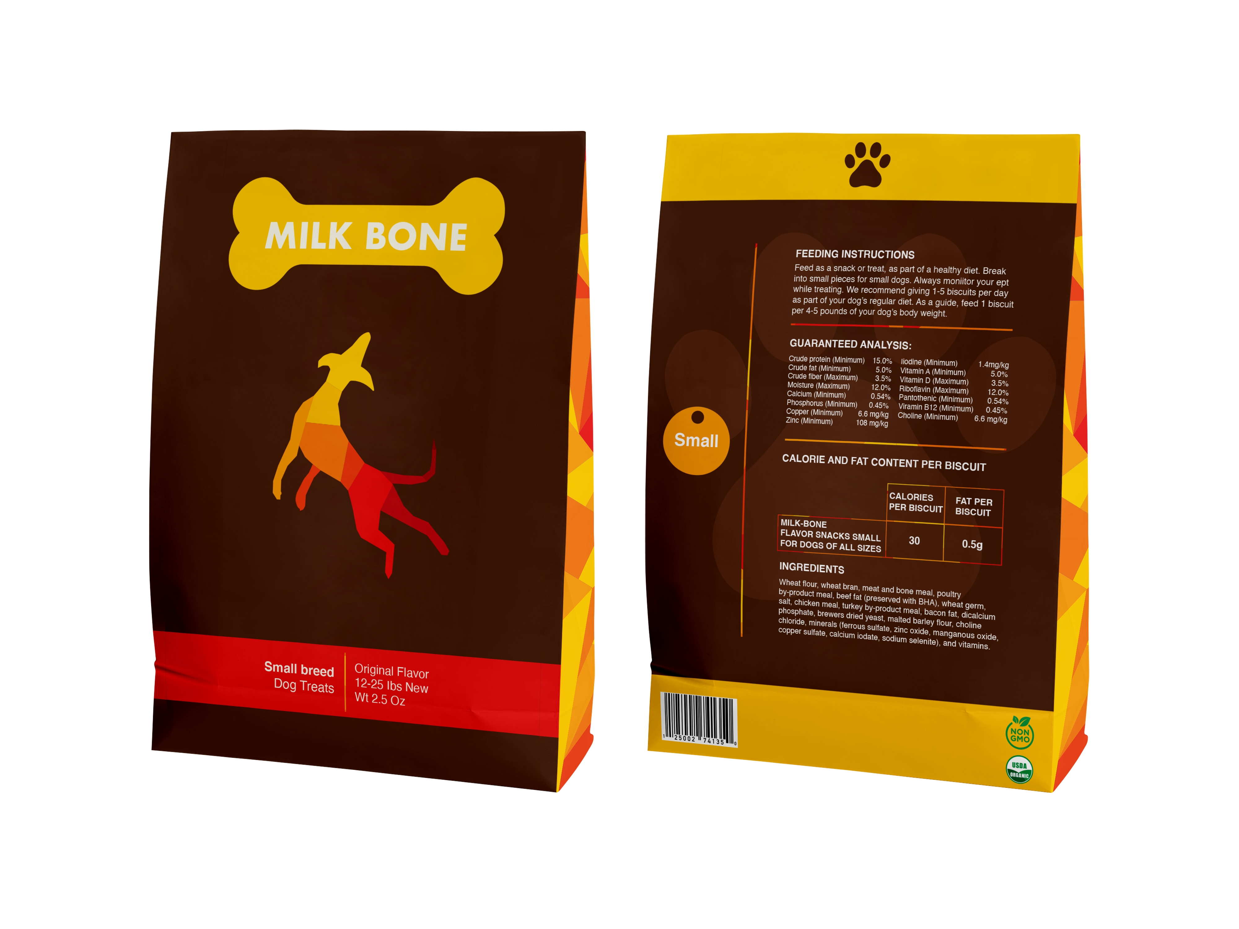
My packaging is a redesign of the overall shape and style of Milk&Bone dog treats. Their old design makes their brand feel generic. This type of packaging makes them appear to be not any different from other non-name brands. My form of packaging gives the brand a more modern look with new colors being introduced and combine with their signature red to bring familiarity a new look. I still kept the bone and a dog in the front of the cover to show people that this product while different is still the brand they know just modernized. I also chose to have geometric shapes to be around the package.
Recent Comments